User Manual
Format

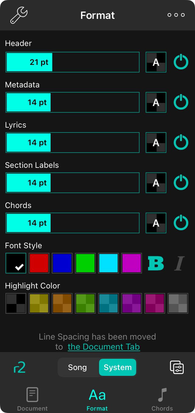
The Format tab lets you change the appearance of the song content. You can change the following aspects of the song.
The style preferences menu is only available for text-based chord charts. If you are viewing an imported file, you will have the option to Extract and Edit or Use Text Version.
Font Family
Four buttons on the top of the menu allow you to choose the font of the entire song. You can choose from:
- Georgia is a serif font that may be easier to read for some users.
- Helvetica is a sans-serif font that is perfect for displaying chord charts. Default.
- Courier is a fixed-width font that is useful in some cases for aligning chords.
- Marker is a handwritten font that is very narrow, allowing more content to fit on the page.
Font Sizes
Below the font family buttons are four sliders. Each one allows the size of different elements on the chord chart to be adjusted. To the right of each is a power button. To turn off one of the items in the list, tap until it turns grey. Tap and slide anywhere in the slider control to adjust the value. Tap on the left or right side of the slider to fine-tune adjust each value by one point.
- Header is the title of the song. You can adjust the font size from 12 to 38 points. Default is 21 points. Turn the header off to have more room on the page for chords and lyrics.
- Metadata is the artist of the song, key, tempo and time signature. This appears below the header. Turn this off, or reduce its size to make more room for chords and lyrics. You can adjust the size from 6 points to 30 points. Default is 14 points.
- Lyrics are nearly everything else on the screen. Turn these off if you just need to play the instrument. You can adjust the size from 6 points to 30 points. Default is 14 points.
- Section Labels are used to display a label for the upcoming lyrics and chords such as "Chorus" and "Verse". The font size of section labels can be adjusted separately along with their visibility. Default is 14 points.
- Chords appear above or within lyrics and can be styled separately to make them more visible. Turn chords off for vocalists or musician who memorize their music. While more options are found below, you can change the size from 6 points to 30 points. Default is 14 points.
Line Spacing
When you want to fit more onto the screen, consider reducing the line spacing, or space between lines. You can also increase the line spacing for more room between lines for better visibility. You can tap on the icons to the left and right of all sliders to fine-tune adjust each value. Adjusts between 0.7 and 1.3 lines. Default is 1.0.
Chord Highlight
This is the color of the background for chords used to highlight them from the page background. Default color presets in the chord highlight palette are the following with a 50% opacity: Clear (default), yellow, orange, green, turquoise, purple, magenta and grey. You can add and customize colors in the chord highlighting palette using the Color Picker.
Chord Style
This allows you to set a color for the chord text as well as to make chords italic or bold for greater visibility. It's recommend that either highlight colors or text colors be used to highlight chords as some combinations may be hard to read. Color presets for text colors include: Black (default), red, blue, green, light blue, and purple. You can add and customize colors in the text color palette using the Color Picker.
You can change the default values of each aspects of the appearance by tapping on the wrench icon in the upper left corner to access the Style Preferences Format options.


