User Manual
Sections

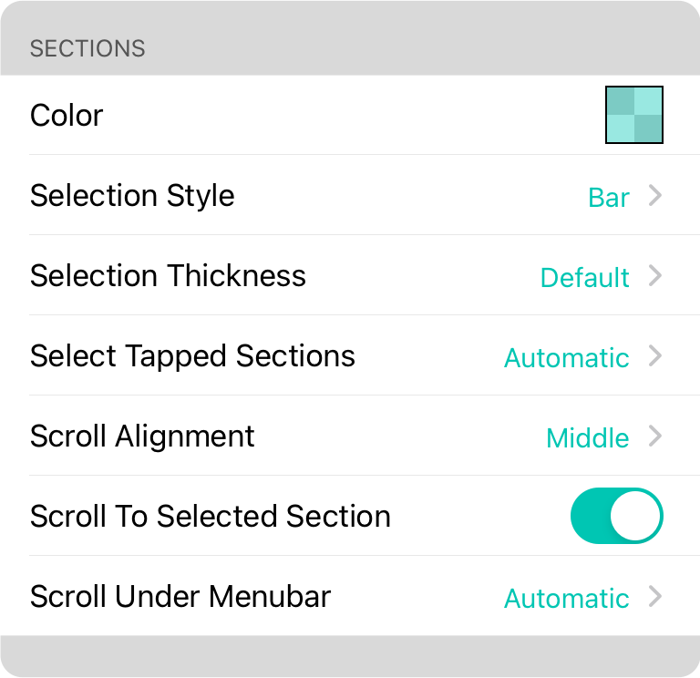
Tapping on the section of a song in the song viewer can select the section. These settings dictate the behavior and appearance of section selection.
Color
You can change the color of the section selector by tapping on the row to use the Color Builder. This will let you create a custom color or choose from the preset palette of these partially opaque colors: Transparent, Red (default), Orange, Green, Blue, Purple, Pink and Grey
Selection Style
The selection style option can be used to greatly improve the visibility of the selected section. You can change this to one of the follow options:
- None turns off visualization of the section selection.
- Bar displays the selection as a thin bar on the left side of the screen. The thickness of this bar is determined by the thickness of the vertical position indicator.
- Page highlights the section across the entire page as if a ruler was placed across the screen.
- Section places a rectangle around the selection section with slightly rounded corners.
Select Tapped Sections
However section selection take precedence over other user input events. OnSong determines automatically if a section should be selected. Options include:
- Never will prevent sections from ever being selected.
- Automatic will determine if the section should be selected based on active features including if MIDI or scenes are assigned to the section, if lyrics projection is enabled or if you are currently streaming to other recipients via OnSong Connect or OnCue. Default.
- Always will always select sections.
Scroll Alignment
When sections are selected, they usually scroll into view in the Song Viewer. This option allows you to define where they should appear in relationship to the viewport. The song viewer will be scrolled as close to the desired settings as possible as long as the song viewer has room to scroll.
- Top aligns the section to the top of the viewable area of the song viewer's view port.
- Middle aligns the section to the middle of the song viewer's viewport. (default)
- Bottom aligns the section to the bottom of the song viewer's viewport.
Scroll to Selected Section
When you tap on a section, it is selected and sends associated MIDI events, changes scenes and presents lyrics. By turning this option on, selecting the section will also reposition it into view on the screen. Default is on.
Scroll Under Menubar
In OnSong, the menubar and statusbar hover above the song viewer. This allows user interface components to smoothly hide for full screen mode. However, when selecting sections, this can cause the content to scroll under the menubar. You can choose from the following options for how content scrolls under the menubar.
- Never will prevent the section from ever scrolling under the menubar under all circumstances.
- Automatic will prevent the section from scrolling under the menubar and statusbar if the menubar is visible and if the menubar is fully opaque. Semi-transparent menubar colors will allow the content to flow underneath the menubar. (default)
- Always will allow content to scroll under the menubar without adjustment.
Note: If you are using an iPhone, the Scroll Under Menubar option also applies to the toolbar that appears at the bottom of the screen.


